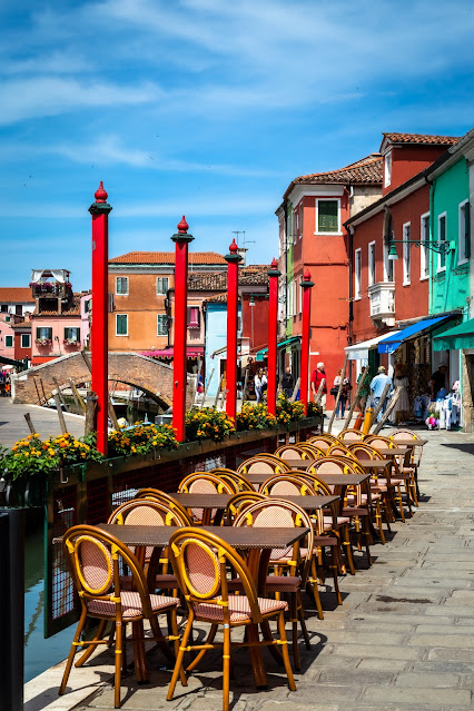
In my last post the colours were limited to mostly shades of blue so today I have decided to go with something much brighter and more vibrant but also to provide some balance I have used exactly the same image and edited it in black and white.
This is a street scene from the island of Burano in the Venetian lagoon. Like the main city the island is crisscrossed with little canals but by contrast there are more open spaces and the whole island has a brighter aspect with the tiny houses and shops painted in vibrant colours. It feels like a lively and welcoming place and for a photographer there is so much to see and to capture.
This was shot fairly early in the day, before the cafés and restaurants started filling up and before the main crowds of visitors arrived for the day.
Most of the pictures I have from my visit on this occasion are full of colour and with more people too and in my opinion they look better in full colour (that is not to say I won't give some the black and white treatment) but for the picture above I think it works a little better in black and white. perhaps it is the angle from which it is taken, the buildings are not the main feature and so the row of tables and the people walking away in the background don't need the full colour, in fact the bright buildings are a bit of a distraction.
What do you think? If you have a view it would be good to hear your thoughts on this. And if you like this please look at some of my previous posts or make sure to come back to see what I post next time.


No comments:
Post a Comment